Category Archives: web design

Woocomerce vs Shopify, which is the best E-commerce platform?

WooCommerce and Shopify are the two most common platforms in e-commerce, currently Woocomerce has approximately 1’000.000 downloaded online stores while the Shopify platform is used by about 800.000 users worldwide.

When an entrepreneur decides to create an online store, different factors about which is the best platform that fits his/her business model and needs need to be considered.

For instance, WooCommerce is an e-commerce plugin that helps to become a WordPress website into an online store. This platform is open source, which allows to be easily modified and also can be installed for free. However, users must pay for security and hosting.

Likewise, Shopify is dynamic, easy-to-use and a reliable platform with great design themes and templates. However, its premium versions and add-ons come at a cost. In the following analysis, I will show both platforms main features and advantages:

Themes and Flexibility.

Shopify has its own template store, which includes 180 designs both premium and free that are easily adaptable and customizable without the need to touch a line of code.

Similarly, Woocommerce templates are easy to tailor and modify thanks to its open source, functional structure and lightweight which allows the pages to look attractive and load quickly.

Ease of use.

Shopify is considered by UX/UI design experts as one of the easiest solutions available for online stores.

Shopify didactic installation instructions, guide users through a step by step process about all the necessary functions needed for each particular store, avoiding undesired technical coding details that could make its installation difficult.

Also, Woocommerce user friendly environment, allows a high degree of flexibility to create a versatile virtual store without coding skills needed for its installation.

Product presentation.

Both platforms offer easy options to upload images, add videos, create product descriptions, enlarge images and to add variations such as changing the color or size of the products.

However, as WooCommerce operates “inside” a personalized WordPress theme, some images or galleries may not work as well as in Shopify, which can create a negative user experience.
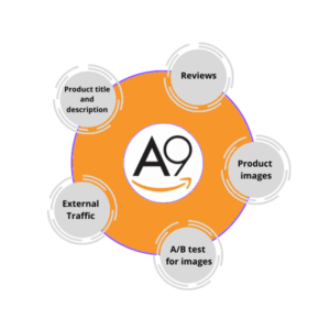
SEO Optimization.

Shopify automatically performs SEO optimization which can be ineffective in terms of improving the quality and quantity of the organic traffic because it displays some elements of the metadata such as article availability or user ratings which can lead to a loss of control over the SEO strategy.

Moreover, Shopify assign URLs to each page, avoiding users to choose the structure of the URLs and limiting accurate web page descriptions of strategic keywords.

Similarly, WooCommerce requires paid plugins such as MOZ or Yoast SEO to achieve optimal functionality and thus rank high in the search engine results page.

Finally, both platforms are the best ecommerce solutions for those who wish to create an online store because of their flexibility, diverse themes, price and ease of use.

Shopify vs Woocommerce

Shopify vs Woocommerce


Facebook new compelling advertisement formats.

Away from the traditional advertisement formats developed in the beginning, Facebook has created new compelling ad formats that are changing the social media marketing landscape and its impact in brands, customers and advertisers.

Facebook Instant Articles ads

When a brand is looking to promote different kinds of content using mobile as an ad placement, the Instant Article ads enables publishers to create fast-loading and interactive content through Facebook’s app.

Moreover, advertisers can choose to place different ads within articles that communicate relevant information about the different products or services they offer.

The two available formats for Instant Articles are video and image in can be placed both in Facebook and Instagram.

Facebook Instant Article ads Format

Facebook Instant Article ads Format

Banners and interstitial ads on Audience Network.

Audience Network is a way to extend publishers ads beyond Facebook and Instagram social media to website and mobile apps.

The banners, interstitial and native ads of Audience Network, allow advertisers to use relevant ad spaces in other digital media outside of the Facebook network.

Also, this ad format, helps Facebook publishers to increase their reach, lower their cost per result and use multiple platforms and devices.

Moreover, it allows publishers to exclude some digital spaces that can damage their brand reputation such as websites related to Gambling, Dating, Debatable social issues or where mature content is promoted.

Facebook Audience Network, works similar to Google Ads Display. The two advertisement formats used in Facebook Audience Network, are images and video.

Facebook Audience Network

Facebook Audience Network

Facebook Collection ads.

Collection ads are an immersive format that allows customers to explore and discovery different products in a unique visual browsing feature all in one ad placement.

Similarly, Collection Ads are available in Facebook and Instagram and they feature a main video or image together with four smaller images below in a grid-like arrangement.

If a customer taps on any of the images or the video of the collection ad to learn more about a product, he/she will immediately go to a visual post-click experience triggered by an Instant Experience or Canvas.

Facebook collection ads format

Facebook collection ads format

Facebook Marketplace ads.

Facebook Marketplace is a space similar to Kijiji or Craigslist where customers can browse and buy different products.

However, listing an item for sale does not necessary means it will sell immediately. As a result, Facebook has created a business tool to help businesses reach more customers through paid ads.

Facebook Marketplace ads promote relevant products and services on Facebook Marketplace.

Thus, customers interested a certain product or service can click to an app, a website, or view details of the product for more information.

Marketplace is available as a placement option only for certain campaign objectives such as Traffic, Reach, Catalog Sales, Conversions, and Video Views objectives.

Facebook marketplace ads

Facebook marketplace ads

How to optimize a product page ranking in Amazon’s search engine?

To optimize a product page in Amazon ecommerce platform, sellers need to consider factors such as product relevance and performance. Improving the quality of those two elements, can help to increase the visibility and position of the page in Amazon’s search engine ranking.

Similarly, Amazon’s search engine technology is based on an algorithm called A9. that helps to determine the relevance, performance and position of a product page in the search results ranking.

Effectively executing the following strategies will help to optimize a product page in Amazon and to convert more leads into sales in accordance to A9 algorithm technology.

Which strategies can help a product page to a have better position in Amazon search engine?

  • Price optimization: Amazon’s A9 algorithm anticipates which products more likely will convert. Therefore, the price factor is crucial to decide where a product  ranks in the search results. Usually, optimizing a product price helps merchants to rank on top in the search results.
  •  
  •  Product description: A product clear and specific description positively impact the number of conversions and the ranking position. Descriptions emphasizing the benefits of the products, using bullet points, improve a product page position in Amazon’s search engine.
  •  
  • A/B test for images: Amazon has an A/B testing tool called Splitly designed to assess which image has the best impact on conversions. Consequently, Splitly  optimize and improve product page ranking.
  •  
  • Titles: Amazon product pages require user-friendly titles that include product’s main keywords and relevant information about its main features.
  •  
  • Customer reviews: A9 algorithm classifies customer reviews by its quality helping to trigger higher conversion rates and better keyword relevance, especially for long-tail terms.
  •  
  • External traffic: Driving traffic from  sources such as email marketing campaigns, social media product accounts or call to actions from the product websites help to improve the position in search engine, gain more relevance.

Amazon’s ecommerce success is based on the premise “the World’s most customer-centric company.”  As a result, Amazon require sellers to create efficient product pages that meet A9 algorithm minimum requirements in order to rank high in its search engine.

How to optimize a product page in Amazon

How to optimize a product page in Amazon

position


What is Landing Page Optimization?

Landing page optimization is the strategic process of increasing the efficiency of a web page designed specifically to generate leads and sales in a digital marketing context.

Landing pages are the target destination of paid online marketing campaigns and usually large amounts of money are invested in driving traffic to these pages.

As a result, there are different methods to make landing pages more efficient and relevant for users, here are some of the most common optimization methods and characteristics:

Main features of a Landing Page Optimization strategy.

  • Relevance: Optimizing a landing page requires that the message you are delivering is synchronized with the expectations of your target public.

           Features such as concise headlines, intuitive layout design, correlation                         between the ad copy and the landing page copy and visible and clear calls to               action help in landing pages optimization process.

  • Brand unit: It is important that your target consumers find consistency among the brand landing pages and all the pages of the brand website.
    Aspects such as images, colors, fonts and navigation help to build brand recognition and make the landing page more usable and optimized.
  • Texts clarity: Optimized landing pages need clear, captivating and impacting headlines. Moreover, the texts should avoid passive voice, unnecessary prepositions, redundant words and phrases.
  • Product/service value proposition: Brands need to showcase the advantages of their products over their competitors and highlight what make their products unique to address customers’ needs.
    Also, brands must integrate the product value proposition in all the content (images and text) of the landing page.
  • SEO Strategy: Brands can bring organic traffic to a landing page with the right set of keywords, enhanced links and a precise meta-description that provide value to customers.

Landing page optimization helps not just to increase sales and generate leads but to learn more about targeted audiences, product and services preferences and to design clear strategies that better convey the right message.

Landing page optimization

Landing page optimization

How to design effective website homepages?

A homepage is the main page of a website, it is the point of entry that gives detailed information about the purpose of such page and to all the information contained within.

Additionally, It helps to navigate the site by displaying links to other pages and articles. In order to have an effective website homepage, designers must ask the following four questions to get the “big picture” of the purpose of the page.

  • What is this homepage for?
  • What do users have here?
  • What can users do here?
  • Why should users be here – and not somewhere else?

These four questions help webmasters to design effective homepages with a more user-centered approach. Moreover, they can help to create easy (self-explanatory), efficient, and enjoyable homepage interfaces.

How can designers convey the right message in a homepage?

  • Homepages need a tagline: It is a brief description of the whole site. It must be coherent and informative. Also, it should communicate differentiation and a clear benefit.
  • A welcome phrase: It is concise information about the site. It can be a two or three lines paragraph displayed prominently.
  • Perform a usability test: Usability tests help designers to understand users’ needs and expectations, identify navigation problems, and generate ideas for improvement. Moreover, it helps to evaluate the homepage user interface (UI), and to find out the best way to present information on such page.
  • Do not hide information that users want and need such as contact information or prices for example.
  • Do not ask information users don’t really want or need to provide.
  • Design with professional graphic standards.
  • Research in advance the main things users want to do on your homepage and make them easy.
  • Tell users what do they want to know when landing in your homepage.
  • Save steps to users in every single navigation process.
  • Make it easy for users to recover from errors.

How to design accesible and more effective homepages?

  • Include the proper alt text to all the images.
  • Forms in the homepage should work with screen readers (use the HTML ‘label’ element to associate the fields with their prompts).
  • All the content needs to be accessible by keyboard.
  • Use JavaScript just when necessary.
Homepage design sketch

Homepage design wireframe.

How to design a usable navigation system for a website?

The navigation system of a website is like the road map that directs users to all the different areas and information contained in it. When the navigation system is clear and well-structured it helps to create trust and credibility, allowing visitors to easily find the information and content they are looking for. However, when that navigation system is confusing and hard to follow it will result in frustrated visitors.

When users navigate in a website, they usually have three main questions to ask:

  • ‘Where am I?’,
  • ‘Where have I been?’ and
  • ‘Where else can I go in this site?’

As a result, and to create easy and enjoyable navigation systems, designers need to follow these suggestions:

What are the attributes of a usable navigation system?

  1. Have persistent navigation– a set of navigation icons displayed on each page. Persistent navigation should include these five elements:
  • The Site ID (logo) – must be placed on the top left
  • A search box placed on the top right
  • home button or tab
  • Utilities(shopping cart, site map, help page etc.)
  • Sections

There is an exception with the homepage (often it doesn’t need the persistent navigation because it is not like other pages). Also, some forms pages like the checkout page in an e-commerce website don’t need persistent navigation.

  1. Display a “You are here” indicator. Designers need to highlight, where the user’s current location is in navigation bars, menus or lists in the page.
  2. Each page must have a page name. The tab that identifies the page name needs to display the content that is unique to this specific page. Also, it needs to be outstanding (it should say, “this is the heading for the entire page”). Moreover, the name needs to match what the user clicked.
  3. Display Breadcrumbs. They are like a secondary navigation scheme that helps users to determine where they are; and an alternative way to navigate around a website They need to place them at the top of the site, organized in a hierarchical manner.
  4. Use tabs. Tabs allow users to easily access different areas of a site or different parts of an individual page. They help to group content, connect related information, and as a tool to save space in a website.

Finally, the importance of a well structured usable navigation system is critical when it comes to differentiate a brand as it plays an essential role in encouraging visitors to stay, view the web content or buy a product.

How do we browse in websites.

How do we browse in websites.

What is website usability?

Website usability can span a few key concepts, but essentially it is focused on making any website as user-friendly and easy to navigate as possible. 

In the book; “Don’t make me think!”, Steve Krug summarizes in a clear style the guiding principles that make a website, a mobile app or any software usable, emphasizing in simplicity and common sense as the foundation to design with a user-friendly approach.

In the second chapter of the book, Krug explains that making pages self-evident is like having good lighting in a store: it just makes everything seem better. This idea intends to clarify how people behave while browsing a website.

How do users interact in websites?

  • Users don’t read pages; they scan them. Usually users are in a hurry and they don’t need to read everything to find what they want.
  • Users don’t make optimal choices; they satisfice. Users don’t choose the best option – they choose the first reasonable option.  Why do users do this?  Because very often they are in a hurry; there’s not much penalty for guessing wrong; weighing options may not improve their chances.
  • Users don’t figure out how things work; they muddle through.  Most of the time, it’s not important to users to figure out how things work in a website, and if they find something that works, they stick to it.
How do we interact in websites.

Interaction in websites.

People don’t like to wonder about how to do things. They enjoy puzzles in their place, when they want to have fun, be challenged or entertained but not when they are trying to find out things on the internet. The fact that the people who develop websites do not care enough to make things obvious and simple can undermine user’s confidence in the site and the company behind it.

 How can we design usable websites?

  • Start with a clear visual hierarchy on each page following these recommendations:
    1. More important items are larger/bolder/distinctive color
    2. Things are “nested” visually to show what is part of what. 
    3. Things that are related logically are related visually.

Also, it is crucial for front-end developers to take these instructions into account:

  • Take advantage of conventions.
  • Divide pages into clearly defined areas.
  • Make obvious what is clickable.
  • Page elements should be uncluttered.
web usability diagram

web usability diagram

In the next post, I will explain why developing usable websites applying these principles, helps to grab users’ attention more effectively and makes navigation easier.

Why is the concept of culture important when creating usable e-commerce websites?

The correlation between web usability and ecommerce is of greater significance as more companies from the developed world, seek to expand their operations into emerging markets.

According to internet usage data published by Nielsen//NetRatings, during the year 2015, 37.4% of the world’s e-commerce activity took place in the Asian market, followed by North America with a 31.7.9%, Europe with a 25.9% and Latin America with 6.3 %. Nevertheless, in the year 1996 most of the ecommerce activity took place in North America with 83% of the world total.

It is clear then, that the largest growth in e-commerce transactions occurred in emerging economies that are also more diverse in terms of cultural identity.

Similarly, with the overall growth of ecommerce business transactions in emerging markets, many companies are adapting their web sites to “local” versions. Such adaptation means a specific web design for each market niche that takes into account language and cultural context, preserving at the same the brand integrity.

For example, some studies explain that culturally adapted web sites crafted for each specific market reduce users’ cognitive efforts to process web information, making navigation easier and improving consumers’ attitudes toward the goods and services offered in such ecommerce site.

Why most companies are not adapting their ecommerce websites to each specific market?

The high costs of testing cultural-tailored websites, the obstacles to find key ethnographic elements that effectively contribute to the site’s visual layout and the propensity to cultural ambiguity are some of the reasons why most companies are reluctant to implement culturally adapted ecommerce websites. For instance, in nations such as China and India, the large number of languages and the different connotations images have in each region, may induce designers and web developers to make mistakes in the interpretation of cultural elements.

Even though the above mentioned issues can deter some companies to adapt their websites design to the cultural identity of each specific market, when companies undertake a comprehensive cultural analysis strategy, their ecommerce websites will become more profitable increasing at the same time, users’ satisfaction levels.

The local web

The local web