The current trend of some companies to use Big Data analytic tools in order to create predictive models of business intelligence is a reality that is impacting the managerial processes in different business environments. However, the fact that the public sector is using more often Big Data analytics to foresee citizens’ needs, change the traditional government management approach that has been in place for decades.
A specific case that elucidates how municipal governments are employing Big Data analytics in their management processes happens in the department of transportation of the city of London, England; TfL, the local government body responsible for the city’s transportation system. This municipal agency has implemented a Big Data analytics strategy that helped to find predictive behaviors of transit users, to identify the needs of the city transportation infrastructure and to improve the agency’s decision making processes.
Similarly, through partnership agreements with different businesses of the city of London, TfL encouraged public transportation users to download a mobile phone application about routes and timetables in their smartphones. The information generated in such app, was intersected with databases that contain information related to routes frequencies in peak hours, routes with greater passenger mobility and annual number of trips per capita using TfL services.
Which aspects of the public transportation in the city of London improved from using big data?
- Transportation user experience: After the analysis of large data sets, Tfl could answer questions such as: What is the main purpose of London citizens to use transit systems? What is the preferred mode of transportation among transit users? What is the main source of information used by citizens to obtain information about routes and schedules and What are the main concerns of transit users about the city’s transportation system?
- Mobility and sustainability: Using big data, Tfl could forecast important variables such as: transit systems future demand, citizens’ ride time using public transit, transportation network planning and its relationship with the environment (stops, routes and frequency), scope of intermodal transportations systems offered by TfL.
- Infrastructure and street furniture: Analyzing large data sets of information, TfL could find out, the impact of new infrastructure in London’s mobility, the use of public space by transit system users and the social and environmental impact of public transportation systems.
- Communications: Based on the amount of data generated through the interactions with TfL users, the agency could design strategies to improve the communication among TfL and transit users and to discover what technological platforms were more popular among citizens to communicate with TfL.
The use of Big Data analytic tools by the TfL, helped to bring effective solutions to the needs of public transit users and to identify the most prominent infrastructure and mobility problems of the municipality.
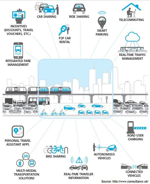
Transportation and big data
____________
The following article portrays the use of Big Data analytical tools to resolve the needs of public transportation systems in other cities in the world: https://channels.theinnovationenterprise.com/articles/big-data-s-impact-on-public-transportation