Google and Facebook are the top two advertisement platforms and leaders of the digital market landscape.
Moreover, both platforms offer the most detailed demographic and behavior targeting thanks to the amount of big data they have about their users, allowing them to convey very specific and accurate commercial messages. But let’s define first each Ad platform:
What is Google Ads?
Google is the world’s most popular and largest PPC advertising platform. Paid ads, also known as pay-per-click (PPC) ads, appear at the top of Google search results. They are labeled with the word “ad” to designate it as paid content.
The main Google Ads networks are:
- Google Display Network
- Google Play
- Google Search Network
- YouTube
- Google Maps
What are Facebook ads?
Facebook is the largest social media platform for paid advertisement. Usually, Ads in this platform are labeled with the word “sponsored” to indicate the content is paid. The following are the networks where Facebook ads appear:
- Messenger
- Audience Network
- Marketplace
- News feed
- Stories
- Instant Articles
- Suggested video
- Right column
- Instant Articles
What kind of big data Google and Facebook collect from their users?
Both advertisement platforms store large amounts of demographic data from their users such as their gender, age, hobbies, career, interests, relationship status and income.
Also, they collect technical information such as users’ location, when and how long they have been in a certain place, installed applications, when such applications are used, downloaded programs in users’ computers or mobile phones, users’ contacts, call history, access to webcams and microphones, emails, calendars, messages sent and received, downloaded files, played video games, shared photos and videos, comments and reactions left in such videos, the music they listen and store, their search and browsing history.
What Facebook and Google do with the big data they collect from their users?
With the big data collected from users, Google and Facebook organize and classify such large volume of data using multiple layers of algorithms. Then, it is analyzed by their systems to create customers’ profiles that help to develop very precise behavioral marketing and advertisement strategies.
Finally, the processed big data is offered to Google and Facebook customers, from retail and consumer brands to governments and politicians, who pay millions of dollars to show products or ideas to audiences who are willing to participate.
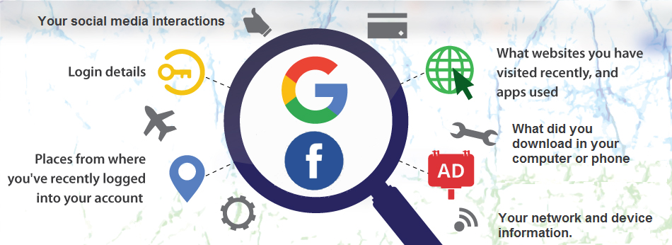
Facebook and Google data